Tag: diagnostics

  • Case Study: How We Found A High-Earning NY Couple $3,334 in Tax Optimizations Their Old Advisor Was Overlooking

    A Brief Message From
    Our Founder

    One of the reasons I got into wealth management was the desire to have a direct and measurable impact on the financial lives of the clients I serve. This case study is an example of how we use our proprietary capabilities to uncover core tax optimizations that our clients’ previous advisors typically overlook. There is nothing more rewarding than providing immediate, tangible results within the first few conversations with a new partner.
    Nathan Kangpan

    Our Clients Were
    Being Underserved
    By Their Prior Advisor

    Our clients are a high-earning, married couple in their 30’s living in New York. They have a combined income in the high six figures and gross investable assets approaching $1m. They came to us because they were unhappy with the advisor they were working with at the time, sensing (correctly) that their old advisor was overlooking many strategies that could help them put thousands more a year towards their financial goals.

    Four Core Recommendations
    That Drove Thousands In
    Tax Optimizations

    “It’s crazy just how much better your approach is compared to our old advisor.”

    – Client Feedback During Initial Performance Review

    We started the relationship by building a comprehensive, dynamic financial plan that would help us fully understood the couple’s financial situation as well as their short, medium, and long-term goals.

    Once we had a holistic picture, we were able to focus our proprietary series of diagnostics on the critical tax, planning, and investment optimizations that would help them put thousands more per year towards their goals.

    We went through our full suite of tax, investment, and planning diagnostics during the onboarding process. While we delivered value across all three of those categories, we want to use this case study just to highlight the key tax opportunities we identified:

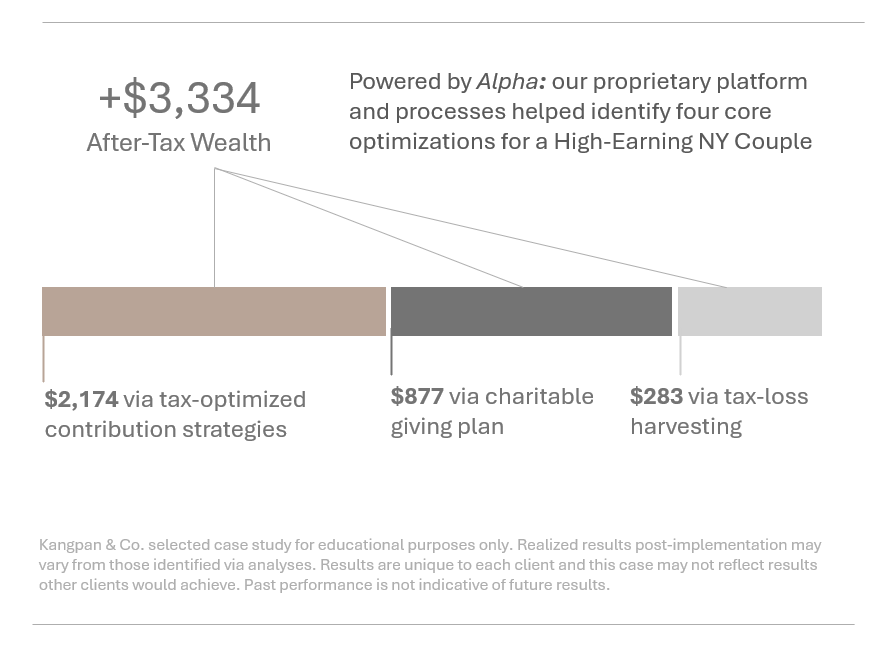
    • Saving for College Before the Stork Arrives: The couple are planning to but do not yet have children. As a highly educated couple, they prioritize college savings in their long-term financial goals and were planning on opening a 529 Plan once they had children. Many couples are unaware that you can open 529 Plans before your kids are born to a) get a head start on saving but also b) start taking advantage of the tax benefits now. We modeled out the tax and long-term savings impact of our clients starting their 529 this year and also helped them set up and fund their account to begin taking advantage of all the tax benefits.
    • Health, Wealth, and a Triple-Tax Advantage: One of the clients has had an HSA for years into which their employer has been contributing $1,000 a year. However, the client had not been adding any additional funds since they felt they were young and healthy and had no need for putting funds into the HSA. We walked them through the triple-tax advantages of the account and also helped them understand how HSAs can function like an additional retirement account once they turned 65… when the funds can be tapped penalty-free for non-healthcare spending.
    • Maximizing Charitable Giving By Waiting for the New Year: Our clients donate to several charities each year. While the amounts are generous, they are not high enough for our clients to itemize. However, in 2026, the OBBBA tax changes will allow couples filing jointly to deduct up to $2,000 in qualified charitable cash donations, even if they take the standard deduction. Based on this change, we advised our clients to wait until Jan 1, 2026 to make some of their planned donations to take advantage of this new deduction policy.
    • Continuous Tax-Loss Harvesting: We identified and realized multiple tax-loss harvesting opportunities as we migrated the clients’ portfolios towards our recommended allocations. While many advisors only look at tax-loss harvesting once a year (if that), we implement it year round to continuously capture opportunities as they present themselves.

    These four optimizations alone added up to more than $3,334 in additional after-tax income that the client was able to build.

    See What Tax
    Opportunities You
    Might Be Overlooking

    We are always proud of the incremental value we identify for our clients and love building a trusted, collaborative partnership developing strategies together to help each optimize their financial future.

    Have one of our advisors help you with a complimentary, 30-minute Tax-Strategy Diagnostic consultation if you’d like to see what kind of value your current advisor or strategies might be missing.

    We’ll be in touch soon!
    Warning

    Disclosures: This is a real-life client case study. The clients in this case study have agreed to be featured in Kangpan & Co.’s materials without any form of direct or indirect compensation. All results are specific to each individual client’s unique circumstances and may not be representative of results other clients would achieve. The clients in this case study have also offered to serve as references to anyone considering Kangpan & Co. and would like to hear what working with our firm is like from actual clients. They receive no form of direct or indirect compensation for serving as a reference.

  • Saving For A Large Purchase? Your High Yield Savings Account Might Be Losing You Thousands A Year.

    This post provides a quantitative analysis of the tradeoffs between using a short-term treasury ETF like SGOV vs. popular High Yield Savings Accounts (HYSAs) for large cash positions. We also discuss the practical differences between the two approaches.

    This is analysis is one of dozens of analyses we do for every Portfolio Efficiency Diagnostic we run for our clients.

    We frequently come across large cash positions being held in High Yield Savings Accounts (HYSAs) when we’re onboarding new clients. These are typically being reserved for big ticket items like a home purchase (upgrades or second homes) or other uses that don’t require same-day liquidity. Our clients tend to also have high incomes and live in high tax states resulting in significant state taxes on cash positions held in these HYSAs.

    We think every data point and item in a client’s financial strategy is worth analyzing and optimizing. But the after-tax yield of our clients’ cash positions is one that we frequently find significant opportunities for improvement.

    We have nothing against HYSAs, they are simple to manage and they are great for earning a yield on funds you use to pay expenses. However, they can be sub-par when used as a savings vehicle for big-ticket purchases or as cash that you don’t need immediate, same-day access to. We feel short-term treasuries can meet this need better, specifically via an ETF which streamlines purchasing and reinvesting in treasuries on an ongoing basis.

    SGOV Currently Yields More Than Many Popular HYSAs

    We’ve compiled the rates being paid by some of the more popular HYSA’s out there as of October 31, 2025:

    • Marcus by Goldman Sachs – 3.65%
    • American Express Personal Savings – 3.50%
    • Capital One – 3.40%
    • Ally Bank – 3.30%

    For comparison, the iShares 0-3 Month Treasury Bond ETF (ticker: SGOV) had a 30-day SEC yield of 3.98% as of October 31, 2025. As a reminder, we are a fee-only fiduciary and do not accept commissions or have direct compensation arrangements with any third party providers.

    It’s also important to note that yields on short-term treasuries, like the yield on an HYSA, will fluctuate with federal interest rates and other factors. The absolute and relative differences between the accounts above and a fund like SGOV are based on the dates we pulled the data and will be different over time.

    Tax Policy Differences May Understate How Much Higher SGOV Yields for High Earners

    The difference in yields between SGOV and the popular HYSAs listed above is immediately apparent. This difference is even more stark if you live in a high-tax state like New York, New Jersey, or California. This is because interest on high yield savings accounts in both of these states is taxed; the interest from treasuries is generally exempt from state taxes.

    Let’s bring this to life with a concrete example. Imagine you and your spouse both work high-paying jobs in California. One of you is in tech and the other is in the medical field. Together you earn $1.2 million a year putting you in the 11.3% CA state income tax bracket (assuming Married, Filing Jointly). You’re saving to put a down payment on a second home and have $300,000 stashed in your HYSA earning 3.50%.

    Here’s how much that $300,000 currently earns before and after state taxes between your HYSA vs. in a short-term treasury fund like SGOV:

    You could end each year with $1,440 more in pre-tax interest by moving your HYSA savings into SGOV on the rate difference alone . This jumps to $2,626 more each year once you take into account the impact of state taxes on the HYSA interest on which, once again, SGOV interest is generally exempt. Note, these figures are before federal taxes which would further decrease all of these.

    So What are the Differences Between a Short-Term Treasury ETF and an HYSA?

    We are not advocating that every high earner in a high-tax state should switch from their HYSA to a short-term treasury ETF for their large cash positions (and especially not for cash held for day to day expenses or immediate liquidity needs). However, we do think everyone should at least understand the numbers behind the different options for their particular situation. From our experience, many high earners are leaving significant amounts of money on the table by keeping their large cash savings in HYSAs.

    There are different mechanics of building and saving in an HYSA vs. short-term treasury ETF. The main considerations between holding your large cash positions in a high yield savings account vs. in a short-term treasury ETF like SGOV are as follows:

    High Yield Savings AccountShort-Term Treasury ETF
    Risk LevelsVery Low
    Up to $250,000 per depositor, per institution is protected by FDIC insurance at federally insured banks and credit unions
    Very Low
    The underlying treasuries are backed by the US government and are considered the “risk free” benchmark by most financial companies
    How to AccessSet up an account with a HYSA provider, connect your bank account, and then set up one-time or recurring transfersBuy the ETF through a brokerage account; set up automatic reinvestment to further streamline the process (optional)
    Withdrawing FundsInitiate a transfer to your linked checking account; some HYSAs also allow access via an ATM or check writingSell ETF shares to reach the amount you need then transfer those funds a to bank account once the trades have cleared
    Withdrawal LimitsSome HYSAs may impose limits on withdrawals (amount or frequency)None
    Interest Subject to Federal TaxYesYes
    Interest Subject to State TaxYes, in most casesGenerally exempt

    Speak with a licensed advisor if you’re unsure how to examine your situation or if you want more guidance on how to switch from a savings strategy built on using a HYSA to one centered around short-term treasuries.

    As we mentioned earlier, this is part of a standard series of diagnostics we run for our clients to ensure their financial system is running optimally. Reach out to us to schedule a complimentary, 30-minute Portfolio Efficiency Diagnostic Preview if you’d like someone to systematically examine your entire financial footprint to identify more opportunities such as this to improve your after-tax returns.

    email: [email protected]

    If you liked this post, you should check out our piece on the basics of tax-efficient asset location or comparing fees on your S&P 500 position.

    Disclosures:
    This content is for educational purposes only and is not investment, tax, or legal advice. Employees and clients of Kangpan & Co. may hold positions in securities discussed in this post. Speak with a licensed tax, legal, or financial advisor before making any changes to your investments or financial strategies. Past performance is no guarantee of future returns. Investing involves risk including the loss of capital.

  • The Real Risk Of Extreme CAPE Ratios: Missing The Upside Could Cost More Than Avoiding The Downside.

    This post looks at how the S&P 500 performs based on CAPE valuations over a 60+ year horizon. We find there are useful signals in extremes of CAPE valuations but acting on those instances is likely more beneficial when the CAPE is substantially undervalued vs. historical averages rather than when it is substantially overvalued.

    Our systematic investment strategies are continuously informed and optimized by the insights generated from our ongoing research. Learn more about how we engineer different risk and return profiles through factor allocations or how incorporating alternatives such as gold and structured credit can help investors better achieve their investment objectives.

    Most clients and prospects we’ve spoken with over the past few months have expressed frustration with their prior advisors not giving them a straight answer on whether the market is overvalued and what, if anything, should be done about it. We like to use data and analysis to inform our reasoning and guidance to clients so let’s take a look at what one of the popular valuation metrics says about the state of the markets today.

    The Market is Overvalued According to the CAPE Ratio

    The CAPE ratio is one of the datapoints we look at when assessing the state of the market’s valuation and long-term prospects (we are strong believers that investment decisions cannot be made with any singular datapoint). The CAPE divides the current market price of stocks by the average of their inflation-adjusted earnings over the past 10 years. It is essentially a PE ratio that looks beyond just one year of earnings in order to smooth out the bumps in the business cycle.

    October 2025’s CAPE ratio was 39.51 according to Schiller’s latest dataset. This is the 98.7th percentile of all available monthly readings. The only other time the CAPE was higher than this was during the lead-up to the Dotcom crash. So, yes, we think the market is richly valued right now vs. historical levels.

    The CAPE Ratio Can Help Inform Allocation Decisions

    While we agree with most investment research that says it’s impossible to predict short-term stock price movements, we feel one can at least make data-informed decisions about medium to long-term allocation choices. We are going to build a simple algorithm for understanding how investment decisions made using CAPE valuations would have historically performed.

    There has been quite a bit written about what the proper long-term CAPE ratio to use as a baseline is given evolving market dynamics, economic regimes, etc. We like to look at backwards-looking, rolling 30-year windows. We believe this helps to adjust for some of these issues. We see what percentile the CAPE ratio is in vs. the range of readings within the past 30 years. We bucket these percentiles into deciles to simplify the final analysis summary.

    The table below shows the average yearly S&P 500 returns from 1957 through 2024 based on what decile the CAPE reading was at the beginning of January of each year. Specifically:

    • Col 1 is the decile we are analyzing
    • Col 2 shows the average yearly S&P 500 return when the CAPE was < the decile
    • Col 3 shows the average yearly S&P 500 return when the CAPE was >= the decile

    For example, if you look at Decile: 2, the table is saying the average yearly S&P 500 return was 16.5% whenever you invested when the CAPE ratio was below the 20th percentile of the past rolling 30 years. It was 11.1% whenever you invested when the CAPE ratio was greater than or equal to that level. The overall average annual return of the S&P 500 during this time period was 11.8%.

    Table 1: Arithmetic Average Annual S&P 500 Returns Based on Rolling 30y CAPE Decile

    DecileAvg. S&P Return < DecAvg. S&P Return >= Dec
    122.8%10.8%
    216.5%11.1%
    316.9%10.9%
    414.6%11.1%
    514.3%11.0%
    615.8%9.1%
    714.0%10.0%
    813.8%8.1%
    912.0%11.1%

    Disclosures: For educational purposes only. Not investment advice. Past performance is not indicative of future returns. Investing involves risk, including the loss of capital. Rolling 30-year decile analysis by Kangpan & Co., data compiled from Damadoran’s “Historical Returns on Stocks, Bonds and Bills: 1928-2024″ and Schiller’s “US Stock Price, Earnings and Dividends as well as Interest Rates and Cyclically Adjusted Price Earnings Ratio (CAPE) since 1871” datasets.

    Key Insight:
    The data suggests increasing S&P 500 allocations when the CAPE is undervalued is more impactful than decreasing allocations when the CAPE is overvalued

    There are a few things about this chart that stand out to us:

    • All Avg. S&P Return < Dec numbers (Col 2) are higher than the long-term average of 11.8% during the full time period; this suggests it is more important to capture the upside when the stock market is undervalued vs. trying to eliminate the downside risk when the market appears overvalued
    • The 3.4% underperformance relative to the overall 11.8% average of investing when the CAPE is >= Decile 8 is less than the 5.4% outperformance of investing when the CAPE is < Decile 3; once again, supporting the point that it is more impactful to capture the upside of the market when it is undervalued vs. trying to protect the downside
    • That said, this analysis suggests there is still a significant, quantifiable underperformance relative to historical average returns of 3.4% that can be avoided when the CAPE is >= Decile 8; however, the follow-up question is whether the alternative investment options available (in this case, 10-year treasury bonds) are expected to return more than 8.1% a year whenever the CAPE is in this range. We will look at this dynamic more closely in a future post.

    What About Protecting Against Crashes?

    The table below shows the largest drawdowns in the S&P 500 by calendar year from 1957-2024 and whether those drawdowns occurred while the CAPE ratio was within a given decile. This view is useful for understanding which drawdowns could have been avoided by not investing in the S&P 500 when CAPE ratios were >= Decile X.

    For example, the table shows that the -11.9% drawdown in 2001 occurred when the CAPE ratio was in the 9th decile. However, the -22.0% drawdown in 2002 occurred before the CAPE ratio reached this level. Meaning, a strategy that avoids investing in the S&P 500 when the CAPE ratio is at 9th decile would not have protected against that particular event.

    Table 2: S&P 500 Drawdowns Averted By Decile

    Year | DrawdownDecile 9Decile 8Decile 7
    2008 | -36.6%
    1974 | -25.9%
    2002 | -22.0%XX
    2022 | -18.0%XX
    1973 | -14.3%X
    2001 | -11.9%XXX
    1957 | -10.5%X
    1966 | -10.0%XXX
    2000 | -9.0%XXX
    1962 | -8.8%XXX
    Crashes Avoided4/106/108/10

    The most interesting thing to note about this analysis is that none of these decile cutoffs protected against the two largest calendar year crashes that occurred in 2008 and 1974 (though the Decile 7 and 8 cutoffs did offer some protection against the 2000-2002 Dotcom sequence of drawdowns). According to our analysis, you would have had to cut investments off at the 6th decile in order to avoid the 2008 crash and the 3rd decile to avoid every drawdown on this chart. Of course, the problem with expanding those cutoffs so far down means you are giving up substantial, long-term upside for this protection by not being invested in the markets.

    These two tables tell us that the CAPE ratio in isolation is likely best used to understand when to increase allocations to the S&P 500 rather than when to avoid investing in it.

    Reach out to us if you’d like to discuss this analysis in more detail or if you’d like schedule a complimentary 30-minute Portfolio Efficiency Diagnostic Preview if you’re interested in learning how our systematic processes could improve your portfolio’s after-tax returns, optimize it’s reward-to-risk ratio, or incorporate an asset mix that better aligns to your long-term goals.

    email: [email protected]

    Disclosures:
    This content is for educational purposes only and is not investment, tax, or legal advice. Employees and clients of Kangpan & Co. may hold positions in securities discussed in this post. Speak with a licensed tax, legal, or financial advisor before making any changes to your investments or financial strategies. Past performance is no guarantee of future returns. Investing involves risk including the loss of capital.

  • Systematic Factor Optimization: How Quality and Size Can Improve S&P 500 Returns

    We utilize factor exposures and alternatives in the various Core and Augmentation portfolios we manage for our clients. This post explores breaking down the S&P 500 into Large and Quality factors and then highlighting how a mix of these factors has outperformed the S&P 500 since 2006.

    If you enjoy this post, check out our research on how alternatives like gold or structured credit can diversify or augment investment portfolios.

    The S&P 500’s returns have dominated global equity markets in recent years. And the returns of the index itself have been dominated by the largest companies that make up the index. This shouldn’t be too surprising given the S&P 500 is a market-cap weighted index; the returns of the index increase in proportion to the rise in individual market values of the underlying companies. Logically, a company valued at $300 billion that increases in value by 10% will impact the index more than a company valued at $30 billion increasing by 20%.

    This doesn’t mean it’s always the same large companies driving the growth cycle. Decades ago it was the Nifty Fifty, in the late 90s it was internet stocks, and most recently it was the Mag 7. The largest companies in the index can, has, and will change over time as business cycles and trends shift. But the impact the largest companies can have on overall returns during periods of broad market growth remains a mathematical constant.

    What’s driving the rest of the return that’s not accounted for by the largest group of companies? Over the long run, we believe it’s companies that exhibit financial traits that signal they are better-run businesses than other constituents of the index. Traits such as having a good return on equity, low debt, and solid business performance overall. The industry calls these companies “Quality” stocks. And research from institutions such as Morgan Stanley show this Quality factor tends to outperform the S&P 500 over very long periods.

    What if you could create a portfolio strategy that lets you:

    • Systematically invest in the largest companies in the S&P 500 index regardless of which companies they are in any given growth cycle
    • Methodically reduce exposure to lower quality companies in the index so you can focus your investment dollars in the highest quality components

    This is the strategy we we want to explore with the rest of this post.

    Here’s a quick graphic to better illustrate how we want to approach this. Imagine each square below represents one company in the S&P 500. We’ve sorted the companies by Market Cap with the larger companies on the left and smaller companies on the right. At the same time, we’ve also sorted the S&P 500 by Quality with the higher quality companies towards the top and the lower quality companies towards the bottom.

    Figure 1: S&P 500 Stocks Sorted By Market Cap and Quality

    We’re now going to carve out the largest companies and the highest quality companies from this universe to focus our investment on the key factors that we want to be exposed to. There are a number of ways to go about this but let’s use two readily available ETFs:

    • Invesco’s S&P 500 Top 50 ETF (ticker: XLG) – invests in the 50 largest companies in the S&P 500
    • Invesco’s S&P 500 Quality ETF (ticker: SPHQ) – invests in the 100 highest quality companies in the S&P 500 as objectively measured by three fundamental measures: return on equity, accruals ratio and financial leverage ratio

    Our exposure to the components of the S&P 500 using these two ETFs now looks something like this:

    Figure 2: S&P 500 Stocks Selected by Large Market Cap and High Quality Exposures

    We’re not just targeting factors, we are also systematically removing lower-quality components of the S&P 500 that introduce uncompensated risk and return drags on the overall portfolio.

    Historical Performance

    This strategy makes for an elegant visual representation, but how does it perform? We’ve developed a few scenarios to understand how different proportions of Large Market Cap via XLG and High Quality via SPHQ would have done against the S&P 500 overall which we are representing with State Street’s SPDR S&500 ETF (ticker: SPY).

    Each column in the table below represents a different investment strategy with the first column serving as the baseline comparison of being 100% invested in SPY. The next three columns represent different % XLG | % SPHQ ratios. The timeframe covers Jan 2006 (when XLG and SPHQ performance data was first available via Portfolio Visualizer) through Sep 2025.

    Figure 3: XLG + SPHQ vs. SPY Metrics

    We apply this kind of quantified, systematic analysis to every facet of investment management. Reach out to us for a complimentary 30-minute Portfolio Efficiency Diagnostic Preview to learn about how our systematic analyses and processes could help you better optimize your portfolio for your needs.

    email: [email protected]

    There are a few things we’d like to draw your attention towards:

    • Annualized trailing returns tend to increase as the proportion of XLG to SPHQ rises across most of the assessed time periods
    • The reward to risk ratio of the strategy (as measured by the Full Period Return to Stdev metric) also tends to improve as increasing levels of XLG are added relative to SPHQ
    • The 75% XLG / 25% SPHQ portfolio outperformed SPY across every assessed time period and also exhibited a slightly better overall Return to Stdev. As the table below shows, $100,000 invested in SPY in January 2006 would have been worth $773,336 by the end of September 2025. That same amount invested for in a portfolio of 75% XLG / 25% SPHQ over that same time period would have resulted in an ending balance of $818,307.

    Implications

    This is an educational analysis highlighting how selectively weighting a US Large Cap position towards various factors can impact return and risk measures vs. the overall S&P 500 index. However, we do not advocate switching a portfolio’s S&P 500 allocations to a static 75% XLG / 25% SPHQ based purely on this analysis. The past decade has seen a very rapid market cap growth in the largest stocks of the S&P 500 which this strategy would have been well-positioned to capture. As of the date of this post, the top 50 companies make up ~60% of the index’s overall market cap with concentration of the top companies reaching historically high levels according to analysts as firms such as Columbia Threadneedle. A 75% weighting to XLG represents an even greater concentration than the current market weighting.

    We incorporate the insights (not the fixed weightings) from this analysis into the portfolios we manage for our clients. We believe the strategic use of different factor ETFs in general is beneficial for systematically increasing or reducing varying exposures to optimize portfolio outcomes for different investors’ objectives.

    Email us to schedule a complimentary 30-minute Portfolio Efficiency Diagnostic Preview if you’re interested in learning how our systematic processes could improve your portfolio’s after-tax returns, optimize it’s reward-to-risk ratio, or incorporate an asset mix that better aligns to your long-term goals.

    email: [email protected]

    Disclosures:
    This content is for educational purposes only and is not investment, tax, or legal advice. Employees and clients of Kangpan & Co. may hold positions in securities discussed in this post. Speak with a licensed tax, legal, or financial advisor before making any changes to your investments or financial strategies. Past performance is no guarantee of future returns. Investing involves risk including the loss of capital.

  • 83(b) – Don’t Miss This Critical 30-Day Tax Window If You Have Equity Compensation

    This is a primer on 83(b) elections including what they are, what you should consider when making an election, and key rules and regulations to be aware of before making an election. A thorough analysis of whether to make an 83(b) election and its associated tradeoffs is part of our Equity Compensation Diagnostic that we offer on a flat-fee basis.

    What is an 83(b) election?

    Filing an 83(b) election allows you to pay the income taxes on the value of your equity or option grants today rather than the value that are at when they vest in the future. Why would someone want to do this?

    Let’s say you’re a VP who works for Public Big Tech Company with each share valued at $1,000 today. You were just given a one-off Restricted Stock Award (RSA) of 500 shares that vests in one year and your effective tax rate is 35%.

    You would owe $175,000 today if you make an 83(b) election and pay taxes on those shares today. Whether that’s a good decision depends on what the expected value of those shares are in the future. The chart below shows the taxes you’d owe depending on the value of each those shares in the future.

    If the shares go up 20% in the next year, you’ll owe $210,000 at that time in income taxes (or $35,000 more than paying today). But if the shares go down, you would have paid more in taxes today than if you would have just waited. This means, of course, making an 83(b) election should only be done if you are bullish on the prospects of the equity value of the company giving you the awards.

    Optimizing Outcomes

    Per the above chart, one of the most critical inputs in deciding to file an 83(b) election is your view on the future value of the grants. But what else might you want to consider as part of the 83(b) decision to optimize your decision-making?

    • Opportunity costs: You should consider what else you could do with the tax payment you’re making whether that’s just having the cash on hand for liquidity needs or investing in other assets.
    • Concentration risks: If you already have a large share of your net worth attached to the company, you are going to be further increasing that concentration by making an 83(b) election for positions you will not be allowed to sell out of until they vest
    • Leaving the company: If you leave the company after you’ve paid the 83(b) election but before your shares have fully vested, you will lose out on both the remaining shares and the taxes you’ve already paid as the IRS will not refund you the tax payment
    • Alternative Minimum Tax: Certain actions like exercising ISOs early and then filing an 83(b) election can trigger the AMT; you should be aware of what these actions, thresholds, and liabilities are before doing anything

    Make sure you think through these considerations before deciding to do an 83(b) election. These analyses (and many others) are part of our Equity Compensation Diagnostic that we use to help our clients get the most out of their equity comp strategy.

    Official 83(b) Rules & Regulations

    Like all tax laws and regulations, there are some critical steps and rules to note about 83(b) elections:

    • You must make the election within 30 days of the grant; this is a strict deadline, no extensions
    • You will need to have the cash on hand to pay the income taxes on the election at the end of the calendar year
    • 83(b) elections are irrevocable, make sure this is what you actually want to do
    • 83(b) elections are made for the full award, you can’t elect to do just X% of the shares or options that make up the grant
    • 83(b) elections are only for grants and awards for which there “is a substantial risk of forfeiture;” not every type of equity or option award or grant qualifies (for example, RSUs typically do not fall under this categorization) it is highly recommended you speak to a qualified advisor about your situation

    Email us to schedule a complimentary 30-minute introductory call if you’d like to learn more about 83(b) elections or explore how to better optimize your equity compensation strategy.

    email: [email protected]

    Disclosures:
    This content is for educational purposes only and is not investment, tax, or legal advice. Employees and clients of Kangpan & Co. may hold positions in securities discussed in this post. Speak with a licensed tax, legal, or financial advisor before making any changes to your investments or financial strategies. Past performance is no guarantee of future returns. Investing involves risk including the loss of capital.

  • Portfolio Efficiency Diagnostic: Quantifying Hidden Tax, Fee, and Performance Drags

    This post details our approach to maximizing the after-tax and after-fee efficiency of a client’s investment portfolios using a Diagnostic. Check out our primer posts on Systematic Optimization  and  Diagnostics to learn more about our unique approach to financial advisory.

    Our Portfolio Efficiency Diagnostic examines opportunities to improve after-tax returns across your portfolio while also systematically looking for places to reduce overall fees and performance drags. Industry research shows the optimizations included in this Diagnostic could have a sizable impact on long-term portfolio returns through improvements such as:

    • Tax-Efficient Asset Location: which can result in 0.14 – 0.41% boosts to yearly after-tax returns according to Schwab
    • Tax-Loss Harvesting: that could lead to 1-2% a year in potential tax savings over 10 years according to JP Morgan
    • Fund Type Optimization: which could reduce fees by 0.51% a year, the average difference in fees between mutual funds and ETFs according to Morningstar

    As with all our Diagnostics, our structured approach ensures we are comprehensively examining your situation in a methodical way, quantifying the tradeoffs that matter, and then aligning your path forward to your unique goals. Our Diagnostics evolve over time as we identify additional analyses and Systematic Optimizations through our ongoing research and work with clients.

    Seemingly small efficiency improvements can have significant immediate and long-term impacts on a portfolio’s returns. As the chart below shows, just 0.50% improvement on a $5 million portfolio could result in $25,000 a year in additional after-tax wealth accruing to an investor.

    The Portfolio Efficiency Diagnostic

    Our Portfolio Efficiency Diagnostic currently contains ten primary Systematic Optimizations supported by dozens of detailed analyses as shown in the table below. All analyses and recommendations are provided to the client as part of our deliverable.

    Table 1: Our Portfolio Efficiency Diagnostic as of October 2025

    Systematic OptimizationsSupporting Analyses
    01: Minimize Index Fees– Identify index-tracking funds within portfolios
    – Compare expense ratios and fund fees vs. similar funds
    – Determine cost-savings opportunities from moving to lower fee alternatives
    See example
    02: Fund Type Optimization– Compare fully-loaded fees on any mutual funds being held with their ETF equivalents
    – Quantify cost impact of switching to lower fee alternatives
    02: Optimize Custodian Fees– Assess trading and brokerage fees across accounts
    – Calculate admin / custodial fees across accounts
    – Determine cost-savings from migrating accounts and providers
    03: Cash Yield– Calculate total cash holdings and corresponding after-tax yield
    – Compare after-tax yield of alternatives
    – Optimize cash positions across accounts to maximize after-tax yield
    See example
    04: Tax-Efficient Asset Location– Calculate current tax load on equity dividends and bond distributions across accounts
    – Determine potential tax efficiencies from moving higher yield and higher tax investments to tax-advantaged accounts
    See example
    05: Tax-Efficient Asset Types – Calculate current tax load on fixed income bond fund distributions across accounts
    – Compare potential tax efficiencies from moving to municipal and other tax-advantaged, fixed income instruments
    06: Tax-Loss / Tax-Gain Harvesting– Identify positions and lots with losses
    – Identify positions and lots with gains
    – Quantify opportunities for optimal tax-loss / tax-gain management
    – Determine opportunities for loss deductions and carryovers
    07: Asset Performance Benchmarks– Compare performance of individual, non-index funds to indexed equivalents
    – Understand performance optimization opportunities from moving to passive index equivalents
    08: Portfolio Performance Benchmarks– Compare performance of overall portfolio to common benchmarks i.e. 60/40 or our Core Portfolios to understand performance and risk optimization opportunities
    09: Account Types – Catalog current accounts and types (i.e. tax advantaged vs. brokerage, etc.)
    – Identify any gaps in account types that could improve after-tax results
    10: Contributions and Funding Strategies – Ensure funding and contribution strategies are maximizing after-tax results or aligned to long term goals (i.e. early retirement, withdrawal needs, etc.)

    Client Implementation

    This Diagnostic is available to our financial planning clients as part of their ongoing deep dives.

    If you’re not already a client, you might currently be paying for management and planning that is not delivering these systematic optimizations. The only way to stop the hidden drags in your portfolio is through an objective, rules-based audit.

    Our Portfolio Efficiency Diagnostic is available for a flat-fee engagement (typically $1,000 to $10,000), which is always priced to be significantly less than the expected quantifiable tax and fee savings we identify.

    Stop guessing about your hidden tax, fee, and performance drags and start executing an optimized playbook to address these issues. Email us to schedule a complimentary 30-minute Portfolio Efficiency Diagnostic Preview to learn more about what we could do for you.

    email: [email protected]

    Disclosures:
    This content is for educational purposes only and is not an investment recommendation. Employees and clients of Kangpan & Co. may hold positions in securities discussed in this post. Speak with a licensed financial advisor before making any changes to your investments. Past performance is no guarantee of future returns. Investing involves risk including the loss of capital.