We utilize factor exposures and alternatives in the various Core and Augmentation portfolios we manage for our clients. This post explores breaking down the S&P 500 into Large and Quality factors and then highlighting how a mix of these factors has outperformed the S&P 500 since 2006.
If you enjoy this post, check out our research on how alternatives like gold or structured credit can diversify or augment investment portfolios.
The S&P 500’s returns have dominated global equity markets in recent years. And the returns of the index itself have been dominated by the largest companies that make up the index. This shouldn’t be too surprising given the S&P 500 is a market-cap weighted index; the returns of the index increase in proportion to the rise in individual market values of the underlying companies. Logically, a company valued at $300 billion that increases in value by 10% will impact the index more than a company valued at $30 billion increasing by 20%.
This doesn’t mean it’s always the same large companies driving the growth cycle. Decades ago it was the Nifty Fifty, in the late 90s it was internet stocks, and most recently it was the Mag 7. The largest companies in the index can, has, and will change over time as business cycles and trends shift. But the impact the largest companies can have on overall returns during periods of broad market growth remains a mathematical constant.
What’s driving the rest of the return that’s not accounted for by the largest group of companies? Over the long run, we believe it’s companies that exhibit financial traits that signal they are better-run businesses than other constituents of the index. Traits such as having a good return on equity, low debt, and solid business performance overall. The industry calls these companies “Quality” stocks. And research from institutions such as Morgan Stanley show this Quality factor tends to outperform the S&P 500 over very long periods.
What if you could create a portfolio strategy that lets you:
- Systematically invest in the largest companies in the S&P 500 index regardless of which companies they are in any given growth cycle
- Methodically reduce exposure to lower quality companies in the index so you can focus your investment dollars in the highest quality components
This is the strategy we we want to explore with the rest of this post.
Here’s a quick graphic to better illustrate how we want to approach this. Imagine each square below represents one company in the S&P 500. We’ve sorted the companies by Market Cap with the larger companies on the left and smaller companies on the right. At the same time, we’ve also sorted the S&P 500 by Quality with the higher quality companies towards the top and the lower quality companies towards the bottom.
Figure 1: S&P 500 Stocks Sorted By Market Cap and Quality

We’re now going to carve out the largest companies and the highest quality companies from this universe to focus our investment on the key factors that we want to be exposed to. There are a number of ways to go about this but let’s use two readily available ETFs:
- Invesco’s S&P 500 Top 50 ETF (ticker: XLG) – invests in the 50 largest companies in the S&P 500
- Invesco’s S&P 500 Quality ETF (ticker: SPHQ) – invests in the 100 highest quality companies in the S&P 500 as objectively measured by three fundamental measures: return on equity, accruals ratio and financial leverage ratio
Our exposure to the components of the S&P 500 using these two ETFs now looks something like this:
Figure 2: S&P 500 Stocks Selected by Large Market Cap and High Quality Exposures

We’re not just targeting factors, we are also systematically removing lower-quality components of the S&P 500 that introduce uncompensated risk and return drags on the overall portfolio.
Historical Performance
This strategy makes for an elegant visual representation, but how does it perform? We’ve developed a few scenarios to understand how different proportions of Large Market Cap via XLG and High Quality via SPHQ would have done against the S&P 500 overall which we are representing with State Street’s SPDR S&500 ETF (ticker: SPY).
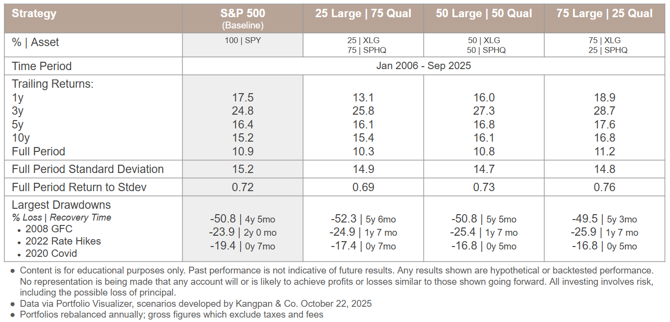
Each column in the table below represents a different investment strategy with the first column serving as the baseline comparison of being 100% invested in SPY. The next three columns represent different % XLG | % SPHQ ratios. The timeframe covers Jan 2006 (when XLG and SPHQ performance data was first available via Portfolio Visualizer) through Sep 2025.
Figure 3: XLG + SPHQ vs. SPY Metrics

We apply this kind of quantified, systematic analysis to every facet of investment management. Reach out to us for a complimentary 30-minute Portfolio Efficiency Diagnostic Preview to learn about how our systematic analyses and processes could help you better optimize your portfolio for your needs.
email: [email protected]
There are a few things we’d like to draw your attention towards:
- Annualized trailing returns tend to increase as the proportion of XLG to SPHQ rises across most of the assessed time periods
- The reward to risk ratio of the strategy (as measured by the Full Period Return to Stdev metric) also tends to improve as increasing levels of XLG are added relative to SPHQ
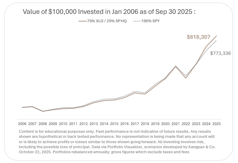
- The 75% XLG / 25% SPHQ portfolio outperformed SPY across every assessed time period and also exhibited a slightly better overall Return to Stdev. As the table below shows, $100,000 invested in SPY in January 2006 would have been worth $773,336 by the end of September 2025. That same amount invested for in a portfolio of 75% XLG / 25% SPHQ over that same time period would have resulted in an ending balance of $818,307.

Implications
This is an educational analysis highlighting how selectively weighting a US Large Cap position towards various factors can impact return and risk measures vs. the overall S&P 500 index. However, we do not advocate switching a portfolio’s S&P 500 allocations to a static 75% XLG / 25% SPHQ based purely on this analysis. The past decade has seen a very rapid market cap growth in the largest stocks of the S&P 500 which this strategy would have been well-positioned to capture. As of the date of this post, the top 50 companies make up ~60% of the index’s overall market cap with concentration of the top companies reaching historically high levels according to analysts as firms such as Columbia Threadneedle. A 75% weighting to XLG represents an even greater concentration than the current market weighting.
We incorporate the insights (not the fixed weightings) from this analysis into the portfolios we manage for our clients. We believe the strategic use of different factor ETFs in general is beneficial for systematically increasing or reducing varying exposures to optimize portfolio outcomes for different investors’ objectives.
Email us to schedule a complimentary 30-minute Portfolio Efficiency Diagnostic Preview if you’re interested in learning how our systematic processes could improve your portfolio’s after-tax returns, optimize it’s reward-to-risk ratio, or incorporate an asset mix that better aligns to your long-term goals.
email: [email protected]
Disclosures:
This content is for educational purposes only and is not investment, tax, or legal advice. Employees and clients of Kangpan & Co. may hold positions in securities discussed in this post. Speak with a licensed tax, legal, or financial advisor before making any changes to your investments or financial strategies. Past performance is no guarantee of future returns. Investing involves risk including the loss of capital.

