Tag: etf

  • Systematic Factor Optimization: How Quality and Size Can Improve S&P 500 Returns

    We utilize factor exposures and alternatives in the various Core and Augmentation portfolios we manage for our clients. This post explores breaking down the S&P 500 into Large and Quality factors and then highlighting how a mix of these factors has outperformed the S&P 500 since 2006.

    If you enjoy this post, check out our research on how alternatives like gold or structured credit can diversify or augment investment portfolios.

    The S&P 500’s returns have dominated global equity markets in recent years. And the returns of the index itself have been dominated by the largest companies that make up the index. This shouldn’t be too surprising given the S&P 500 is a market-cap weighted index; the returns of the index increase in proportion to the rise in individual market values of the underlying companies. Logically, a company valued at $300 billion that increases in value by 10% will impact the index more than a company valued at $30 billion increasing by 20%.

    This doesn’t mean it’s always the same large companies driving the growth cycle. Decades ago it was the Nifty Fifty, in the late 90s it was internet stocks, and most recently it was the Mag 7. The largest companies in the index can, has, and will change over time as business cycles and trends shift. But the impact the largest companies can have on overall returns during periods of broad market growth remains a mathematical constant.

    What’s driving the rest of the return that’s not accounted for by the largest group of companies? Over the long run, we believe it’s companies that exhibit financial traits that signal they are better-run businesses than other constituents of the index. Traits such as having a good return on equity, low debt, and solid business performance overall. The industry calls these companies “Quality” stocks. And research from institutions such as Morgan Stanley show this Quality factor tends to outperform the S&P 500 over very long periods.

    What if you could create a portfolio strategy that lets you:

    • Systematically invest in the largest companies in the S&P 500 index regardless of which companies they are in any given growth cycle
    • Methodically reduce exposure to lower quality companies in the index so you can focus your investment dollars in the highest quality components

    This is the strategy we we want to explore with the rest of this post.

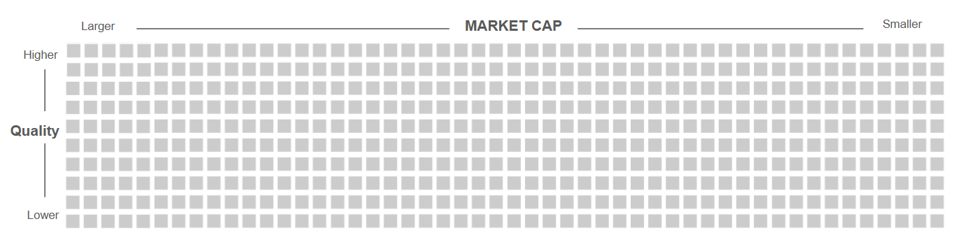
    Here’s a quick graphic to better illustrate how we want to approach this. Imagine each square below represents one company in the S&P 500. We’ve sorted the companies by Market Cap with the larger companies on the left and smaller companies on the right. At the same time, we’ve also sorted the S&P 500 by Quality with the higher quality companies towards the top and the lower quality companies towards the bottom.

    Figure 1: S&P 500 Stocks Sorted By Market Cap and Quality

    We’re now going to carve out the largest companies and the highest quality companies from this universe to focus our investment on the key factors that we want to be exposed to. There are a number of ways to go about this but let’s use two readily available ETFs:

    • Invesco’s S&P 500 Top 50 ETF (ticker: XLG) – invests in the 50 largest companies in the S&P 500
    • Invesco’s S&P 500 Quality ETF (ticker: SPHQ) – invests in the 100 highest quality companies in the S&P 500 as objectively measured by three fundamental measures: return on equity, accruals ratio and financial leverage ratio

    Our exposure to the components of the S&P 500 using these two ETFs now looks something like this:

    Figure 2: S&P 500 Stocks Selected by Large Market Cap and High Quality Exposures

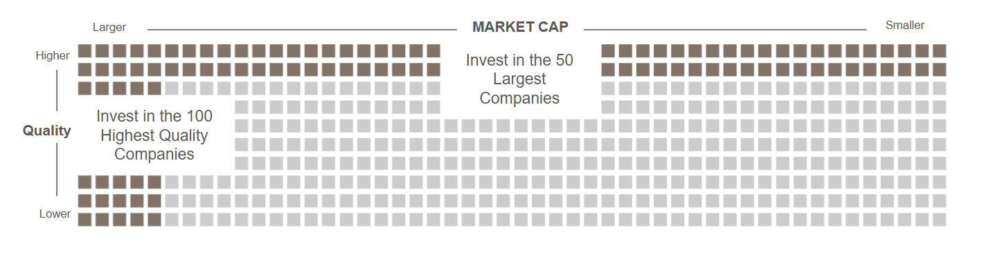
    We’re not just targeting factors, we are also systematically removing lower-quality components of the S&P 500 that introduce uncompensated risk and return drags on the overall portfolio.

    Historical Performance

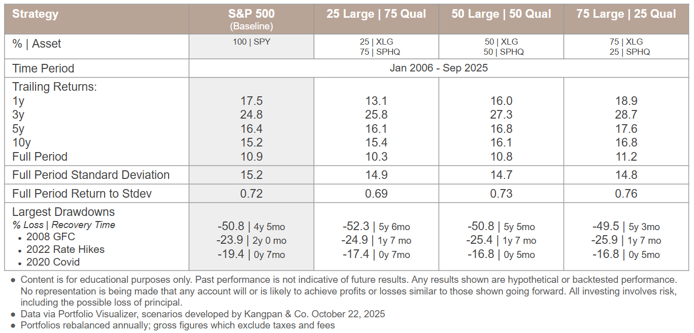
    This strategy makes for an elegant visual representation, but how does it perform? We’ve developed a few scenarios to understand how different proportions of Large Market Cap via XLG and High Quality via SPHQ would have done against the S&P 500 overall which we are representing with State Street’s SPDR S&500 ETF (ticker: SPY).

    Each column in the table below represents a different investment strategy with the first column serving as the baseline comparison of being 100% invested in SPY. The next three columns represent different % XLG | % SPHQ ratios. The timeframe covers Jan 2006 (when XLG and SPHQ performance data was first available via Portfolio Visualizer) through Sep 2025.

    Figure 3: XLG + SPHQ vs. SPY Metrics

    We apply this kind of quantified, systematic analysis to every facet of investment management. Reach out to us for a complimentary 30-minute Portfolio Efficiency Diagnostic Preview to learn about how our systematic analyses and processes could help you better optimize your portfolio for your needs.

    email: [email protected]

    There are a few things we’d like to draw your attention towards:

    • Annualized trailing returns tend to increase as the proportion of XLG to SPHQ rises across most of the assessed time periods
    • The reward to risk ratio of the strategy (as measured by the Full Period Return to Stdev metric) also tends to improve as increasing levels of XLG are added relative to SPHQ
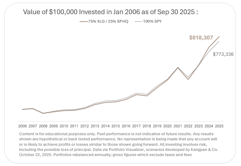
    • The 75% XLG / 25% SPHQ portfolio outperformed SPY across every assessed time period and also exhibited a slightly better overall Return to Stdev. As the table below shows, $100,000 invested in SPY in January 2006 would have been worth $773,336 by the end of September 2025. That same amount invested for in a portfolio of 75% XLG / 25% SPHQ over that same time period would have resulted in an ending balance of $818,307.

    Implications

    This is an educational analysis highlighting how selectively weighting a US Large Cap position towards various factors can impact return and risk measures vs. the overall S&P 500 index. However, we do not advocate switching a portfolio’s S&P 500 allocations to a static 75% XLG / 25% SPHQ based purely on this analysis. The past decade has seen a very rapid market cap growth in the largest stocks of the S&P 500 which this strategy would have been well-positioned to capture. As of the date of this post, the top 50 companies make up ~60% of the index’s overall market cap with concentration of the top companies reaching historically high levels according to analysts as firms such as Columbia Threadneedle. A 75% weighting to XLG represents an even greater concentration than the current market weighting.

    We incorporate the insights (not the fixed weightings) from this analysis into the portfolios we manage for our clients. We believe the strategic use of different factor ETFs in general is beneficial for systematically increasing or reducing varying exposures to optimize portfolio outcomes for different investors’ objectives.

    Email us to schedule a complimentary 30-minute Portfolio Efficiency Diagnostic Preview if you’re interested in learning how our systematic processes could improve your portfolio’s after-tax returns, optimize it’s reward-to-risk ratio, or incorporate an asset mix that better aligns to your long-term goals.

    email: [email protected]

    Disclosures:
    This content is for educational purposes only and is not investment, tax, or legal advice. Employees and clients of Kangpan & Co. may hold positions in securities discussed in this post. Speak with a licensed tax, legal, or financial advisor before making any changes to your investments or financial strategies. Past performance is no guarantee of future returns. Investing involves risk including the loss of capital.

  • Our Core Portfolio Strategies

    This post provides more detail on how we develop a Core portfolio strategy for our clients. This post should also help potential clients better understand how our mindset and approach may be different from the typical advisor.

    The Role of the Core Portfolio

    Designing and managing a Core portfolio is one of the foundational investment management services we provide to clients. As the name implies, the Core portfolio should be the reliable engine to take an investor from where they are today to where they want to be in the future with as minimal drama as possible. The Core portfolio is where an investor will keep the majority of their assets. This means a Core portfolio must adhere to our three key investing tenets:

    • Short term returns for any asset class are unpredictable so a Core portfolio needs to be truly and widely diversified across uncorrelated asset classes
    • Base rates are a strong guide to long-term returns so we should make decisions on which assets to include and in what proportions based on robust historical data that covers a wide range of business and economic cycles; these assets will be held for the long term and rebalanced to target allocations rather than actively traded
    • Avoid permanent losses of capital in this portfolio by focusing on funds of diversified assets and strategies with established, audited track records rather than becoming overly concentrated in individual stocks or securities; we will be methodical in how we administer the portfolio such as minimizing tax drags based on where we locate assets, rebalancing the portfolio, and selecting funds to be included

    The Core portfolio is primarily composed of a customized mix of low-cost, diversified ETFs across the following asset categories:

    • Equities (Stocks): These are the primary drivers of long-term returns within most portfolios. Depending on a client’s comfort with risks and return objectives, we integrate a mix of equities that span different geographies (i.e. US, International) and different factors (i.e. Large Cap Growth, Small Cap Value)
    • Fixed Income (Bonds): These can be used to provide steady income within a portfolio or function as ballast for when equities experience stress periods. Depending on a client’s income needs and risk tolerance we will look to include fixed income options that span a range of durations and credit qualities.
    • Alternatives: These are investments we use to further diversify the mix of Stocks and Bonds in a portfolio ideally seeking to increase returns while reducing overall risks. Assets used here could include commodities such as gold, managed futures, structured credit, etc.

    Our comfort with alternative investments is one of the traits that makes us different from typical advisors. For examples on how we think about how alternatives can improve the return / risk profile of a portfolio, check out our post about gold’s role in portfolio or our post about how structured credit like AAA CLOs can enhance yields.

    While the Core portfolio generally does the bulk of the heavy lifting for an investor, it’s important to point out that we feel investors should have two other types of portfolios to form a well-rounded investment plan: a Cash portfolio and an Augmentation portfolio. The table below highlights key aspects of each portfolio and we will discuss the other two portfolios in more depth in future posts.

    Building a Client’s Core Portfolio

    While there are common building blocks across the Core portfolios we manage, we customize each one to the unique needs and risk tolerances of every client. This is typically done by following three key steps.

    Step I: Understand a client’s goals and timeframes to establish a target return

    In order to determine what return we need from our portfolio, we first need to figure out where we are at and where we are trying to go. Many investors have a vague sense of wanting to “retire earlier” or “build more wealth,” but we need to better quantify those notions in order to create objective targets. Once we know our goals, we can then figure out what return we need from our portfolio. This is something we work closely with our clients to understand before we make any investments.

    Let’s go through an example to help illustrate what we’re talking about.

    The Johnson’s are a family of two working professionals in their mid 40’s with two kids. They currently have an investable portfolio of $1.8 million and want to retire in 10 years with $7.5 million. They expect to be able to add $200,000 a year to their investable assets between now and then.

    Using our dynamic planning tools, we determine together that they will need to earn a return of at least 8.9% a year over the next 10 years to reach their $7.5 million goal.

    We use sophisticated modeling to convert vague goals into objective return targets.

    Illustrative example using Kangpan & Co. planning tools to determine expected asset levels along with associated confidence intervals. Modified for demonstration purposes.

    Step 2: Understand a client’s comfort with risk and return to establish a baseline allocation using traditional assets (i.e. Stock and Bond mix)

    The baseline rate of return of a Core portfolio is predominantly determined by its ratio of Stocks to Bonds. This forms the baseline allocation of the portfolio. Alternatives, which we discuss in the next step, are used to manage the risk profile of a portfolio.

    The table below shows the long-term historical performance and key risk metrics of various mixes of Stocks/Bonds that we pulled together using Portfolio Visualizer’s asset backtesting module. We show tables like this to clients to guide conversations about what baseline mix should be used as a starting point to reach their return goals.

    Each column represents the results for a different mix of Stocks/Bonds with Stocks represented by US Large Caps (a proxy for the S&P 500) and Bonds represented by 10yr Treasuries. For example, the column 100/0 is a portfolio comprised of 100% Stocks and 0% Bonds while the 60/40 column is a portfolio of 60% Stocks and 40% Bonds.

    We can see based on the table that in order for the Johnson family to get their target 8.9% return, they will need to have a portfolio that is somewhere between a 40/60 portfolio (with an 8.5% expected return) and a 60/40 portfolio (with a 9.5% expected return).

    Table 1: Return and Risk Profiles for Various Stock/Bond Portfolio Mixes

    Return and risk profiles for various mixes of stocks to bonds in a traditional baseline portfolio.

    However, in addition to understanding how returns are affected by the mix of Stocks and Bonds in a portfolio, we also use the data in this table to better understand how our clients feel about risk. Specifically we look at data points like how volatile the portfolio is on a year to year basis, how severe downturns have been (the Max Drawdown metric), and how long each portfolio took to recover from those downturns.

    Step 3: Adjust the return and risk profile of the baseline portfolio to the client’s needs by more broadly diversifying the base asset mix and selectively incorporating alternatives

    Our first step identified what minimum return level we need to target in order to help our client reach their goals on the timeline they desire. Our second step gave us a better understanding of how the client views the tradeoffs between risks and potentially higher returns. These prior two steps give us the inputs we need for our final step with a client… fine-tuning the risk and reward ratios of a baseline Stock and Bond portfolio by introducing additional diversifiers.

    Let’s say in our discussion with the Johnson’s in the prior step that they liked the idea of retiring with $8.3 million instead of $7.5 million if they could earn the historical 10.2% returns of an 80/20 portfolio (who wouldn’t?). However, among other issues, they did not like the amount of additional risk that came with that portfolio’s Max Drawdown of -39.2% vs. the 40/60 portfolio’s -19.0%.

    This is where we can use a wider range of funds and alternative assets to help our clients balance the returns they want with the potential risks of a portfolio. In the table below, we are showing a simplified example of enhancing the portfolio with just two additional asset classes:

    • US Small Cap Value: research shows US Small Caps and Value factors tend to outperform US Large Caps over time
    • Gold: an alternative asset class that can help diversify portfolios consisting of Stocks and Bonds

    Strategically incorporating these two additional asset classes allows us to boost backtested returns to the levels of an 80/20 portfolio while having the risk characteristics more aligned to a 40/60 portfolio:

    Table 2: Returns and Risks for Systematically Enhanced Portfolio vs. Stock / Bond Mixes

    Incorporating additional asset class exposures such as US Small Cap Value and alternatives such as Gold to a traditional Large Cap and Bond portfolio can enhance risk-adjusted returns

    This is where the power of being open to incorporating alternatives comes into play for clients – we can better engineer a portfolio’s returns and risks to meet the unique needs and desires of each client.

    We primarily use alternatives in publicly available ETFs rather than private options because they are generally:

    • More transparent: so both our advisors and our clients are clear on what is being added to the portfolio
    • More liquid: the tradability of ETFs makes rebalancing or strategic shifts in allocations much easier to accomplish
    • Lower fee: ETFs tend to (but not always) have lower fees than private funds for similar strategies and implementations

    Real-World Client Implementation

    The example in the prior section is purely illustrative and for educational purposes only. In the real world, we look across a much broader set of investable options across stocks, bonds, and alternatives. The actual individual securities and funds we use to set up our clients’ positions which will have a different return and risk profile from those based on overall asset class returns used in our example.

    Our clients benefit from the ongoing research we conduct for each asset class inlcuding:

    • How the asset class relates to the rest of the portfolio by understanding historical correlations, stress periods, return and risk profile, etc.
    • How different allocation weights affect the overall portfolio’s risk and return metrics across various time periods
    • Our preferred fund or individual security(ies) for gaining access to that asset class

    Our selection process for specific securities we use in portfolios depends on the asset class we are researching and our clients’ specific needs. For examples of some of the factors we consider check out our post on selecting an ETF for S&P 500 exposure or our preferred International funds

    Once a Core portfolio strategy has been developed, we then help clients implement and manage the portfolio on an ongoing basis including:

    • Reporting / Monitoring
    • Rebalancing
    • Tax-Loss Harvesting
    • Adding / Removing Assets Over Time

    Our fees and minimums for designing and managing a Core portfolio strategy can be found in the Service Models & Pricing section of our investing services page. We also work with clients on a flat-fee project basis for those that just want access to our portfolio advice and construction process rather than ongoing management.

    Email us if you’d like to discuss anything in more detail or learn more about our services.

    email: [email protected]

    Disclosures:
    This content is for educational purposes only and is not an investment recommendation. Employees and clients of Kangpan & Co. may hold positions in securities discussed in this post. Speak with a licensed financial advisor before making any changes to your investments. Past performance is no guarantee of future returns. Investing involves risk including the loss of capital.

  • SPY vs. VOO? Don’t Overpay For Your S&P 500 Position

    This is going to be a short one. I’m surprised how often I come across individual investors who hold State Street’s SPDR S&P 500 ETF Trust (ticker: SPY) over Vanguard’s S&P 500 ETF (ticker: VOO). What’s the difference between these two? Not a lot besides fees, at least for the typical medium to long-term investor1.

    As of the date of this post, SPY has an expense ratio of 0.0945% while VOO sits at 0.03%. That means for every $1,000,000 invested in SPY, you are paying $945 a year in fees to iShares. The same amount invested in VOO translates to $300 a year going to Vanguard. This is a $645 a year difference for two very similar products that track the same index.

    Paying the lowest fee for a fund isn’t necessarily the best strategy to pursue when you are looking across different types of strategies. An alternative credit ETF has a different operational setup and risk / return profile than a large cap index ETF. But fees are very important when comparing funds that track the same strategy and index.

    If all things are more or less equal between two ETFs, then the lower fee version should have consistently higher returns roughly equal to the gap in fees. Let’s take a look at the average annual performance for SPY vs. VOO to see if the lower fees on VOO appear to translate to higher returns:

    TickerYTD1yr3yr5yr 10yr
    SPY10.71%15.85%19.40%14.64%14.46%
    VOO10.79%15.96%19.53%14.70%14.57%

    Market price returns are before tax and inclusive of reinvested dividends and net of fund fees as of August 31, 2025. Data from each provider’s website.

    What you see is a pretty consistent 0.06% to 0.13% performance lag from SPY vs. VOO across all time periods above. Other factors can affect performance such as tracking error as well as premiums / discounts to NAV but we believe the fee difference is a significant contributor to the performance difference in this case.

    This is an example where knowing what to do (invest in a low-cost S&P 500 ETF) is not the same thing as knowing how to do it optimally. We focus a lot on the optimal here at Kangpan & Co. since we believe even seemingly small Systematic Enhancements can compound into significant benefits to our clients over time. In this case, it’s not just the $645 a year for every $1,000,000 a client has invested in a S&P 500 tracker. It’s the tens of thousands of dollars that translates into when you consider a) that fee difference is lost to the investor every year and b) those fees lost out on reinvested compounding returns.

    As a reminder, we do not accept commissions or other forms of direct compensation from any third parties. This post is our own unbiased research and analysis.

    Email us if you’d like to discuss anything in more detail or learn more about our services.

    email: [email protected]

    Disclosures:
    This content is for educational purposes only and is not an investment recommendation. Employees and clients of Kangpan & Co. may hold positions in securities discussed in this post. Speak with a licensed financial advisor before making any changes to your investments. Past performance is no guarantee of future returns. Investing involves risk including the loss of capital.

    1. There are other considerations such as differences in liquidity, premium / discount to NAV, etc. that could impact some types of investors such as very active traders

  • Enhancing Short-Term Yields With AAA CLOs

    Wait, CLOs? That sounds vaguely like those things that blew a hole through the economy back in 2008… Close, but it was actually CDOs that contributed to the meltdown. According to VanEck’s William Skol:

    “… not only did CLOs have nothing to do with the Global Financial Crisis, the asset class thrived through the 2008 crisis relative to other fixed income asset classes.”

    Read on if you’re:

    • Looking for ways to increase yield in your portfolio without taking on significant credit risks
    • Interested in alternative credit options available in liquid forms

    As a reminder, we are a fee-only fiduciary advisor and have no compensation arrangements with any of the funds discussed below.

    A Quick CLO Primer

    The love of TLAs (three-letter acronyms) within the financial world plays a part in this confusion between CDOs and CLOs. I spent a summer internship back in the mid-2000s structuring both these and other derivatives, and I still had trouble keeping all the acronyms straight as I was completing my rotation on the desk.

    Collateralized Debt Obligations (CDOs) can be comprised of a variety of debt instruments including unsecured and junior obligations. It was sub-prime mortgage CDOs that played a dominant role in the 2008 collapse. We’re not going to cover CDOs any further in this post.

    Collateralized Loan Obligations (CLOs) are a form structured credit that are generally backed by senior secured loans from corporate borrowers. Senior meaning first in line to be paid if a company experiences financial troubles. Secured meaning they are backed by the company’s assets.

    The underlying loans within a CLO are also usually both liquid and tradable. Each CLO is generally made up of 150-250 individual loans. These loans are then further divided into a layered loss structure called “tranches” where losses are absorbed by each layer in a cascading sequence.

    These layers are rated like other credit instruments from CCC (the riskiest) to AAA (the least risky). In order for AAA-rated CLO tranches to take a loss, all other preceding layers need to have blown out. This makes the AAA-rated CLO tranche a relatively lower risk investment vs. other corporate credit options out there.

    How much lower risk? As the fixed income team at BlackRock points out in their March 17, 2025 article:

    ” … no AAA-rated CLO has ever defaulted.”

    I recommend checking out both the VanEck and BlackRock articles linked above for a more in-depth overview.

    JAAA ETF Overview

    CLOs have been around for decades now but only recently became available in a more easily accessible, liquid ETF form. They come in a variety of versions including those focused just on AAA-rated tranches which is what we’ll spend the rest of this post discussing.

    There are multiple AAA CLO ETFs available (that’s three TLAs in a row if you’re keeping score), but we’ll use Janus Henderson’s (ticker: JAAA) for our analysis which is both the largest by AUM and the one that has been around the longest. Here’s a quick rundown of JAAA’s core attributes:

    MetricJAAA
    Closing Market Price$50.68
    30-Day SEC Yield5.39%
    Net Annual Expense Ratio0.20%
    Number of Holdings453
    Effective Duration (Yrs_0.12
    Returns
    YTD
    1y
    3y

    3.51%
    5.85%
    7.02%

    Via https://www.janushenderson.com/en-us/advisor/product/jaaa-aaa-clo-etf/ ; data as of close on September 17, 2025 except returns which are as of August 31, 2025 and represent total average market-price returns including distributions

    Beyond JAAA’s yield and performance, one of the most important characteristics of JAAA is its very low duration of 0.12 years which (a) gives this fund’s price very low interest rate sensitivity and (b) essentially makes this a floating rate investment.

    We need to put JAAA’s performance in context by comparing against a benchmark asset. Here are a few key traits we need to consider when selecting a comparison asset:

    • A fixed income investment
    • Invested in AAA-rated credits or higher
    • With a very short duration

    These attributes make the iShares 0-3 Month Treasury Bond ETF (ticker: SGOV) a solid contender to compare as the benchmark which is a fixed income product, invested in government debt, with a duration of just 0.09 years. Here are the attributes side-by-side:

    MetricJAAASGOV
    Closing Market Price$50.68$100.57
    AUM$25.2 billion$57.7 billion
    30-Day SEC Yield5.39%4.19%
    Net Annual Expense Ratio0.20%0.09%
    Number of Holdings453na
    Effective Duration (Yrs)0.120.09
    Returns
    YTD
    1y
    3y

    3.51%
    5.85%
    7.02%

    2.1%
    4.51%
    4.80%

    – JAAA data via https://www.janushenderson.com/en-us/advisor/product/jaaa-aaa-clo-etf/
    – SGOV data via https://www.ishares.com/us/products/314116/ishares-0-3-month-treasury-bond-etf
    – Data as of close on September 17, 2025 except returns which are as of August 31, 2025 and represent total average market-price returns including distributions

    A current yield spread of 120 bps and a persistent 134 bps increase in returns vs. short-term treasuries across time periods seems pretty good for a AAA-rated fixed income alternative with similar duration. So what’s the catch?

    JAAA’s Historical Drawdowns

    While the total return for JAAA has exceeded those of SGOV since JAAA’s launch, that return has come with a bit more volatility.

    Unlike short-term treasury funds, short-term AAA CLOs ETFs can and have experienced notable drawdowns due to increased credit exposure and other factors. Let’s explore what these drawdowns have been.

    AAA CLOs have existed for decades but JAAA itself has only been around since October 2020. That means we can only look at a handful of stress periods to get a sense for how well it has held up. The chart below shows the three largest drawdowns for JAAA since launch with the following data points:

    • The start month of each drawdown and the end month when the lowest price was hit for that stress period
    • The Underwater Period which is the length of time between the drawdown start date to when when the investor fully recovered their initial investment inclusive of reinvested distributions
    • The max % total loss experienced (i.e. inclusive of distributions) during the drawdown

    The largest drawdown was during 2022, aka the worst overall bond market since 1949 according to Bank of America and other bond analysts. JAAA’s drop during this time was primarily due to the aggressive rate hikes that resulted in a repricing of CLOs across the board along with increased trading activity among various market participants. However, it’s important to note that the relatively short Underwater Period of 11 months can be attributed to two key factors:

    • The very short duration of JAAA’s holdings which significantly reduces interest rate sensitivity as the holdings mature essentially making its holdings floating rate instruments so as the interest rates ratcheted up, the underlying holdings increased yields with less price impact than many other fixed income investments
    • The underlying changes to NAV were not due to credit issues given none of the holdings defaulted during this time (and, if you recall from earlier, no AAA CLO has ever defaulted as of the date of this post).

    While by no means risk-free, we feel JAAA has held up fairly well under a relatively limited set of stress scenarios. That said, there are other considerations an investor should look into as well when assessing an investment like this such as tax implications, target interest rate exposure, etc.

    Client Portfolio Strategy

    Like many alternatives, AAA CLO ETFs aren’t necessary or even appropriate for every portfolio. Here are common situations where we think about utilizing these investments:

    • Clients with income-centric portfolios that want to enhance their yield within their short-term exposures without taking on significant credit risks
    • Clients with large cash and other liquid holdings that want to further enhance their yield for funds they are not anticipating needing within the next 1-2 years

    There are other situations where we would consider including these liquid alternatives in portfolios based on client needs and risk tolerances which we help clients model out and understand the expected benefits and implications in doing so.

    If you’d like to discuss anything in more detail, reach out to your dedicated advisor if you’re a current client or email us to learn more about our services.

    email: [email protected]

    Disclosures:
    This content is for educational purposes only and is not an investment recommendation. Speak with a licensed financial advisor before making any changes to your investments. Past performance is no guarantee of future returns. Investing involves risk including the loss of capital.

  • Our Preferred International ETFs in 2025

    Investors often want to diversify their US-centric holdings with international stock exposure. A common question is which fund they should include and how much they should allocate. This piece will discuss our systematic process for selecting international funds along with which ones we prefer to recommend to clients based on portfolio goals.

    INSIGHT
    Interestingly, we found Vanguard’s Total International Stock Index Fund (ticker: VXUS), one of the largest and most commonly recommended passive international index funds, came in 8th place using our aggregated, rank-ordered performance methodology. Spoiler alert, this is not one of our preferred recommendations.

    As a reminder, we are a fee-only fiduciary advisor and have no compensation arrangements with any of the funds discussed below. These funds were chosen as our preferred options for clients as a result of our own objective research.

    Our Process

    We looked at more than 20 of the most popular International ETFs screening for funds that have at least five years of historical performance.

    We pulled reported trailing market performance on September 1, 2025 from each of the fund’s web pages for 1, 3, 5 and 10 year periods (or whatever timeframe was the furthest available).

    We then assigned a rank-order score to every fund within each performance time period. For example, IDMO was the best performer in the 3 year time period so it receives a rank-order score of “1”. IVLU was the 4th best performance in the 3 year time period so it receives a rank-order score of “4”.

    Once each time period was rank-ordered, we then summed the scores across 1, 3, 5, and 10 year time periods to create a composite rank-order score. This final score allows us to sort for aggregated performance across all time periods, rather than focusing on a single one. It also provides an easier way to assess relative differences by looking at the numerical “distance” between the aggregate scores which we discuss a bit more below.

    The chart above is a partial snapshot of our analysis. You can see that Invesco’s IDMO was a strong performer across all time periods which resulted in an aggregate score across every period of “7.” The second best performer across all time periods was iShares’ IVLU with an aggregate score of “20.”

    This distance 13-point difference between IDMO and IVLU is significantly larger than the 2-point difference between IVLU and our third place performer. This is where the aggregated distance score helps us not only objectively rank-order the funds we assessed but also gives us a straight-forward heuristic to measure their relative differences.

    Additional Considerations

    Of course, just simply screening for trailing performance shouldn’t be the only consideration when selecting funds. We’re not short term performance chasers. We also look at other aspects of each fund including:

    • Fund Strategy: It shouldn’t be a surprise that we prefer simple, systematic strategies that are easily explainable and repeatable over purely discretionary decisions.
    • Stress Tests: We looked at the drawdowns during recent stress periods such as 2022’s stock and bond dual decline to understand how different funds held up under duress.
    • Correlations: We want an International strategy that provides some level of diversification from other major asset classes within a portfolio, especially vs. US Large Cap holdings.

    A walkthrough of these additional analyses along with our full dataset are available to clients upon request.

    Funds We Like

    Here’s where we’ve landed after our assessment of the International ETF landscape. For clients that want:

    • Higher Returns with More Risk: Invesco’s International Momentum ETF (IDMO) had consistent outperformance across multiple time periods vs. most of the other funds we looked at. However, we also saw greater drawdowns during some of our stress test periods vs. IVLU and VYMI along with higher correlations to the S&P 500.
    • Diversification and Less Volatility: iShares’ International Value ETF (IVLU) was our second-highest rank-ordered fund across time periods. Although slightly lower returns across time periods than IDMO, this fund also tended to exhibit better resilience during stress periods.
    • Income: Vanguard’s High Dividend International ETF (VYMI) was just short of having 10 years of trailing return data but ranked fairly well when looking across 1, 3, and 5 year time periods. The appeal is in it’s twelve month distribution yield which was approximately 3.90% as of September 12, 2025 – higher than the TTM yield on both IVLU’s 3.60% and IDMO’s 1.92%. That extra 30 bps of yield compared to IVLU equates to $3,000 more per year in pre-tax income for every $1,000,000 invested.

    We incorporate International funds into many of our Core investment strategies and provide advice on how to add International exposure into portfolios on a project basis.

    If you’d like to discuss anything in more detail, reach out to your dedicated advisor if you’re a current client or email us to learn more about our services.

    email: [email protected]

    Disclosures:
    This content is for educational purposes only and is not an investment recommendation. Speak with a licensed financial advisor before making any changes to your investments. Past performance is no guarantee of future returns. Investing involves risk including the loss of capital